Workshop Data The data used in this workshop are the locations and magnitudes of earthquakes across the globe beginning in 2014 through the present. The data are compiled by the United States Geological Survey (USGS) and can be obtained from http://earthquake.usgs.gov/earthquakes/search/. Note: the data have been modified from the original source to include the country and some demographic parameters for this example. If you obtain data from the USGS in the future, it will not have these fields. Earthquakes occurring more than 35 km from the coast of any country have also been excluded.
What are some examples of analysis you could do with the data using your current Excel skills? What kind of stories can we tell with the data if we are able to map it? Considerations When you're creating a map, it's easy to get carried away and try to add a very large amount of data to the map. It's important to keep in mind that plotting too many individual features on a map can lead to viewer confusion and frustration, and doesn't provide a clear picture of your data. In addition to creating a map that's difficult to interpret, trying to add a large number of rows to a map negatively impacts the performance of ArcGIS Maps for Office. If your data contain a very large number of features, you can try adding it to the map in subsets; for example, if you have 100,000 features, create two separate layers containing 50,000 points each. For this reason, ArcGIS Maps for Office restricts the number of features you can add to a map without impacting performance. Data import limits per layer are as follows:
Excel currently allows for a maximum of 5 maps in an Excel workbook. Signing In
Adding a Map to Excel To use Maps for Office, your data need to contain some sort of location information. The app is very flexible in the format it will accept, such as street addresses, latitude and longitude values (coordinates), or place names such as a United States city, United States county, state, world city, country, ZIP Code, or census tract. When you create a map, your data are automatically scanned for location information, so naming the columns of your location data appropriately helps the app. Note that the columns containing location data can be named anything you desire and manually selected when you add the data to a map. What columns in the sheet contained location information?
Data can be mapped using a cell range, or better yet, from a table in your spreadsheet. First let’s select a cell range from our data.
The app will scan the cell range and try to find our location data. What location type is selected for us by default?
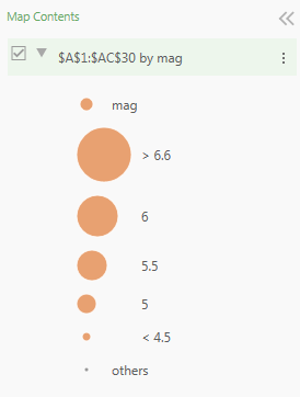
The app analyzes your data and suggests the best ways to represent it on a map, offering a selection of styles for you to choose from. The options are different for categorical and numerical data. Our spreadsheet contains a mix of numerical and categorical data, so a number of options are displayed. To begin, we will map each earthquake with varying symbol sizes related to the earthquake magnitude. What do you need to select as your Style by Column? 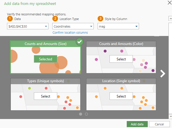
The map zooms to the location of our first 30 earthquakes, located in Afghanistan, with the Layer Style panel open on the left side of the map. This is the panel where you can customize the symbol shape, color, size, transparency, and many other options.
 The Map Contents shows up on the left of the map by default. This is where all data layers in the map will appear, and you can turn layers on and off, select layers, rename layers, and re-order the layers.
Navigating around the map
By default, the map will be floating -- that is, it will be in its own window. You can maximize the window or resize it. You can also dock the map into the spreadsheet as you would a chart.
Change the Basemap The basemap if the bottom-most layer in the map. All of the data layers we add are drawn on top of the basemap. You can choose from a variety of basemap styles - imagery, topographic, streets, artistic - to suit the theme and purpose of your map.
Importing Data from a Table
What will the earthquake data look like in our map?
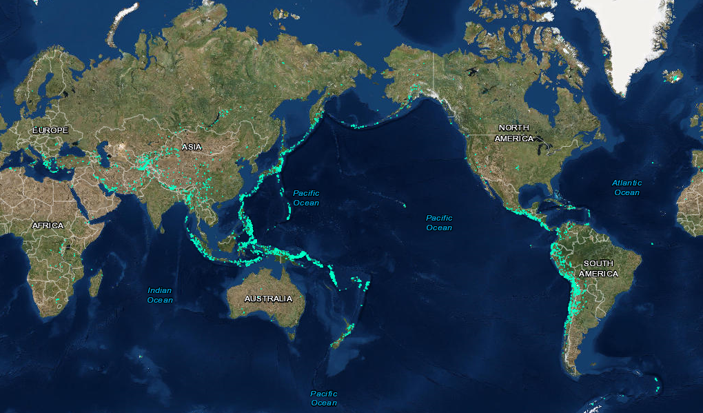
Do the data display as you imagined they would? The app has combined our individual points into clusters. When more than a few hundred points display, this is the default. Let’s see all of our data instead!
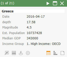
What can you learn from this map that wasn’t apparent from the spreadsheet? Configuring the Pop Up Clicking on one of the points on the map will open a pop up window listing all of the data from that row in the spreadsheet. You can customize the information contained in the pop up and adjust the column names.
Changing the Layer Style You have seen two ways of representing our data so far. The styles available to you depend on the geometry of the data -- whether it can be represented by a point, a line, or a polygon. The styling options are also influenced by the kind of data associated with features in the layer. For example, a point feature may only have location information such as geographic coordinates, categorical information such as retail location type, or numerical information such as sales details. Not every styling type can be used for every kind of data. Style by location (using a single symbol) This is how we are currently displaying the earthquakes. Drawing your data using a single symbol gives you a sense of how features are distributed—whether they're clustered or dispersed—and may reveal hidden patterns. For example, our earthquakes are concentrated along the margins of tectonic plates. We can customize the symbol.
Style by counts and amounts (using colors) You can distinguish features based on a color gradient using numerical values in your spreadsheet. There are different kinds of color gradients that you can use; for example, a simple light-to-dark color scheme is good for showing low-to-high data values such as profit or revenue. Color sequences like this can be applied to poi nts, lines, or polygons. Let’s again visualize the earthquake magnitudes using a color gradient.

Notice the options available to you.
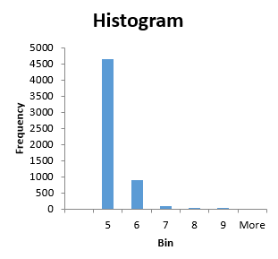
Classification You can organize your data into groups, called classes, and use the same symbol for each class of data. You can have up to 10 classes in the map, though it generally gets more difficult to distinguish classes as the number of classes increases. Typically, the goal is to get data that are the most similar into the same class, and you have options for how you can create the classes. Changing the classes and classification method will result in very different looking maps, with the objective being to get your classes to be both appropriate for your data and easily understood by the viewer.
Do you have any ideas on which may be most appropriate for our earthquake magnitude data?
What can you infer about the data distribution? (Look at the histogram underlying the slider or refer to this data histogram below). Is Quantile a useful classification method for our data?
Which method seems most appropriate for distinguishing differences in the earthquake magnitude?
Style by type (using unique symbols) We can represent our data with different symbol sizes based on a range of values, as you have seen before. Use what you have learned about classification to experiment with this style!
Style by Heat Map Heat maps display the relative density of points on the map as smoothly varying sets of colors ranging from cool (low density of points) to hot (many points). This type of map works best with dense data. You can vary the color bar as well as the area of influence to make broader or finer areas around your points.
Selecting Data and Searching by Location Maps for Office gives you powerful tools to find data in your spreadsheet based on location. Using the Find Nearby tool, you can select data and filter your spreadsheet to show other data within a specified distance or driving time of an individual or set of data points.
How many earthquakes occurred within 50 miles of this spot in our data? How about within 100 miles of this spot? (Note: you may need to go Back and Clear the selection before analyzing again).
Representing Data Using Polygons So far we have used points to add our data to a specific coordinate. The Maps app can interpret columns in the spreadsheet which relate the row to other locations, such as cities and countries. It also interprets areas, such as a country, state, census tract, and zip code. We can symbolize our data not only as points, but we can do a quick analysis and map how many earthquakes occurred in each country.
Notice that there were errors when we imported the data. Some countries were not interpreted properly. Let’s inspect the errors and try to fix what we can.
Most of the missing earthquakes errors came from the Russian Federation. Let’s try replacing the data in our spreadsheet and adding the table once again.
Which style do you prefer the most for these data? Why? Is it possible to visualize your data with more than one style simultaneously? Mapping Temporal Data If your data contain a date and time, you can create animations to visualize temporal changes. Our data have a field called date which lists the date as text, but Excel needs them in a specific format before it will interpret properly. Use the functions LEFT() and DATEVALUE() to convert the text to a date Excel can use.
Adding data from ArcGIS Online Maps for Office enables you to access the data available to ArcGIS Online users and use it in your map. This is a great way for colleagues to share their map data with one another or to enhance your maps. Note that in some cases the ability to modify the style of the data and use the data for analysis may be limited by the data publisher! Let’s look at how to add data from ArcGIS Online.
Publishing Your Map To ArcGIS Online The ArcGIS Maps for Office app enables you to share your layers and maps with others in or outside of your organization through ArcGIS. When you share a map in Excel, a web map is created on ArcGIS. This published map can be viewed in a browser or you can continue to work on it in ArcGIS Online or Desktop. This process also allows you to add a dynamic, interactive map to a PowerPoint slide. You can also publish individual layers from your map as geospatial datasets. Note that publishing a layer as a feature service will not include the other data in your map. Publishing your map will automatically publish each of your layers as a feature service that will be available to you and anyone you give permissions.
Note: You can update the map and republish it to ArcGIS by pressing Update shared map under the Tools menu and modifying the information you entered as needed. |