1. IntroductionThis tutorial provides step-by-step instructions for how to use ArcGIS Pro software. You will learn the components of the software interface, how to preview datasets, connect to databases, and make 2D and 3D maps.
Clemson Center for Geospatial Technologies Our mission is to support all faculty, students, and staff in their GIS-related activities. Our services include consultations, data gathering, advanced spatial analysis, effective cartographic display, instruction, class lectures, customized workshops, troubleshooting and licensing. Goals By the end of this workshop, you will be familiar with: - Learning GIS Activities
- Using the Software Interface
- Previewing Data
- Making Maps and Scenes
- Exporting a Map
Getting the software and workshop materialsOption A) If you have ArcGIS Pro installed on your local machine, click here to download the workshop material. Copy and paste the workshop material to your Documents directory (instructions for downloading and installing ArcGIS Pro on your machine are here) OPTION B) If you are using Virtual Access through My Clemson Apps, copy the downloaded folder to your Documents folder. OPTION C) If you are using Virtual Desktop, you can access your Downloads folder by going to C:\Users\"your Clemson username"\Downloads
2. What is GIS? A geographic information system (GIS) is a computer-based tool that links geographic information (where things are) with descriptive information (what things are). Before GIS, we used to have paper maps to navigate ourselves in the world.  GIS data have two key features: GIS data have two key features:
1) Geographically referenced to the earth.
2) Every location has associated attribute information.
GIS data are referenced to the earth, they can be placed spatially on a map.
A GIS takes a referenced representation of the world and slices it into layers or themes.
Because those layers are referenced, they line up and their associated data now also lines up. With that spatial relationship between data we can perform overlay or spatial analysis.
A GIS is: "A system for capturing, storing, checking, integrating, manipulating, analyzing and displaying data which are spatially referenced to the Earth (Chorley, 1987)."
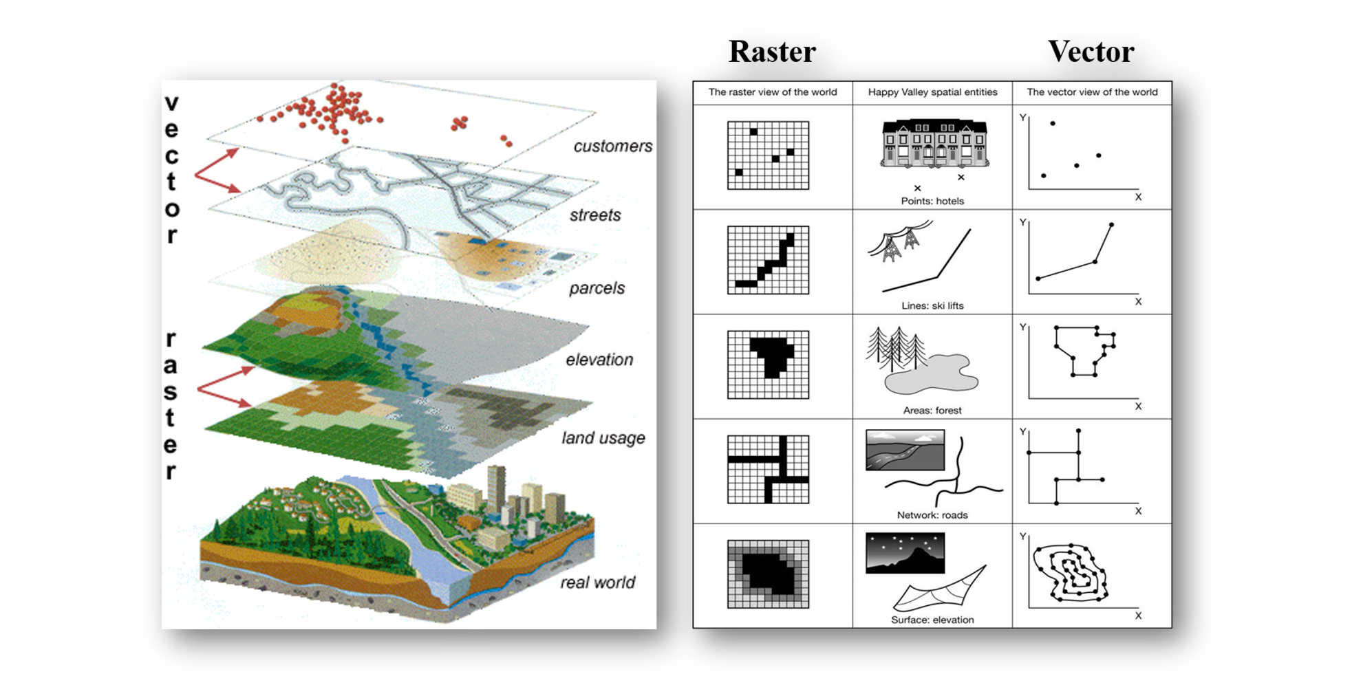
3. GIS Data A GIS stores information about the world as a collection of thematic layers that can be linked together by geography. Data Models (Vector & Raster)GIS data come in two formats: raster and vector. Raster is represented by a grid of pixels, just like a digital image in which each pixel has a value. It is used primarily for continuous data (elevation, temp, precip, pollution, slope, solar radiation). Vector data are represented by points, lines, or polygons. Data is stored not as a grid but as a series of coordinates. Vector is used primarily for discrete data (roads, rivers, wells, sites, towns). Each vector object is a single feature in the data (even if it’s made up of complex geometry).
Shapefile vs. Geodatabase
Over the years, ESRI has developed three main data formats for storing geographic information—coverages, shapefiles, and geodatabases. Shapefiles were developed to provide a simple, nontopological format for storing geographic and attribute information. Because of the simplicity of shapefiles, they are a very popular open data transfer format. A shapefile may take up three to five times as much space as a file geodatabase or SDE because of shape compression methods.
4. Getting Started with ArcGIS Pro After you downloaded the workshop material, follow the steps below to unzip the file:
Opening the Software & Logging In
Go to the Start menu and open ArcGIS Pro and sign in using your Clemson ID. ArcGIS Pro uses a project file (.aprx) as its default file type to manage and organize your work. An ArcGIS Pro project can contain lots of different items, such as maps, scenes, layouts, data, tools. It may be connected to many different folders, databases, and servers. Content can be added from the cloud by connecting to ArcGIS Online. Each project that is created will have it’s own database and toolbox created along with the project file. We will start exploring the software using an existing project. At the end of this tutorial, you will have recreated the project on your own. Click on Open another project, navigate to the workshop folder at Documents > Intro_to_GIS_with_ArcGIS_Pro > IntroWorkshopExample, click on IntroWorkshop.aprx within the folder you copied. 5. ArcGIS Pro Interface 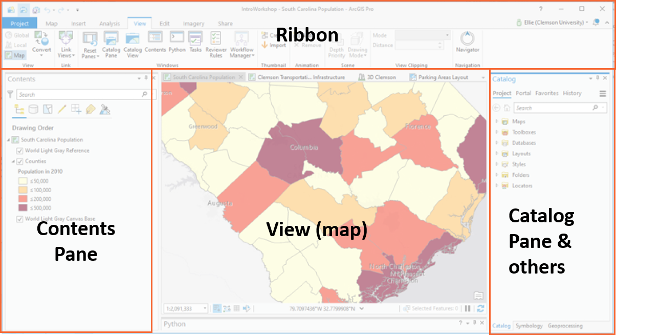 ArcGIS Pro is a ribbon-based application. Many commands are available from the ribbon at the top of the ArcGIS Pro window; more advanced or specialized functionality is found on panes (dockable windows) that can be opened as needed. ArcGIS Pro is a ribbon-based application. Many commands are available from the ribbon at the top of the ArcGIS Pro window; more advanced or specialized functionality is found on panes (dockable windows) that can be opened as needed.
Along the top of the screen is the ribbon. The ribbon has a set of core tabs—Map, Insert, Analysis, View, Edit, Imagery, and Share—that are always present when a map view is active. Each tab has its own set of tools, organized in groups. The application also responds contextually to your work. Tabs on the ribbon change depending on the type of item you're working with.CatalogOn the right-hand side is the Catalog pane. When you create or open a project, one of the first panes you see is the Catalog pane. The catalog view is open and active if you create a new project using the Catalog blank project template provided with ArcGIS Pro. The Catalog pane and the catalog view allow you to access all items associated with a specific project in one place, whether they are available from a local or network computer, ArcGIS Online, or an ArcGIS Enterprise portal. In other words, it shows the organization of your project and the items you can access, such as databases, toolboxes, and connections to folders and network drives. ContentOn the left-hand side is the Contents pane. This shows all the layers present in the map view, scene view, or layout view that is active. You can turn layers on and off, reorganize layers in the map, and interact with map layers from this pane. Panes can be hidden temporarily to clean up your view. They can also be moved to different locations based on your preferences. Click the Auto-Hide button in the Contents pane (the pushpin). The pane will collapse to the side of the interface. Clicking on it will open it temporarily. Click the Auto-Hide button once again to show the pane.
6. Exploring Data  Viewing Attribute Table Viewing Attribute Table
You have seen that clicking on a feature in the map opens a pop-up window with a snapshot of attribute data, and you have previewed attributes in the Catalog view. You can also open the attribute table to see the entire database, query it, and perform calculations (which will be the topic of future workshops). To open the attribute table for our counties: Right-click the Counties layer in the Contents pane and click Attribute table. The table opens underneath the Map view.
You can perform many operations on the fields by right-clicking on them: Right-click the NAME column and select Sort descending. Click the X to close the table.
2D: Navigation  On the Map tab, the Explore tool allows you to move around the map as well as get more information about features. On the Map tab, the Explore tool allows you to move around the map as well as get more information about features.
Click the Explore tool. Then click and drag the map to a different location. You can zoom in and out using the mouse wheel.
If you have gone too far away, click on Bookmarks in the Navigate group and select SC extent.
Click on a county on the map. You will see a pop-up with descriptive information about the feature.Notice there are three other views open in the project: the Clemson Transportation Infrastructure map view, the 3D Clemson scene view, and the Parking Areas layout view.
Click the Clemson Transportation Infrastructure tab to see the map view.
This map shows transportation infrastructure assets around Clemson’s campus, such as parking lots and bike racks.
In the Contents pane, click the small gray arrow next to the Parking Lots layer to expand it. What do these colors show?
3D: Navigation
 We will now get our feet wet with the 3D capabilities of ArcGIS Pro. To start, click on the 3D Clemson view. We will now get our feet wet with the 3D capabilities of ArcGIS Pro. To start, click on the 3D Clemson view.
Click on the Explore tool. Try panning the scene by dragging it, zooming in and out by holding the right mouse button, and holding down the mouse wheel to rotate the view.
Notice in the lower-left corner there is an additional navigation tool. You can use this to pan, zoom, and rotate the scene.
So far we haveexplored the software interface, learned a bit about the Project file, and gotcomfortable navigating in map and scene views. Next, you will re-create theproject from scratch, making the map and scene views, and setting up a layoutto export a map. 7. Creating a Map  Starting a New Project Starting a New Project
Now that you are familiar with the interface, we will create a blank project.
Close the ArcGIS Pro software. Do not save any changes to the IntroWorkshop project.
Open ArcGIS Pro once again. The Start page will open.Here you haveoptions for creating a project using templates with different starting points,such as with a map or a scene. We are going to use the Catalog template to see the tools for previewing data without usinga map. Under theBlank Templates, click on Catalog.The window opens to create a new project. For name,type Intro_to_GIS_***,replacing the asterisks with your name. For location,click the folder icon to choose anew location. Under the > Documents > Intro_to_GIS_with_ArcGIS_Pro.Click OK, then OK again to finish.
 The project will open showing the Catalog view, which enables you toinspect and preview data without adding it to a map or scene view. This canhelp you understand the extent of data you obtained, explore its attributeinformation, and view metadata, or informationabout the dataset. Additionally, you don’t have to create a map view just tosee what is in a dataset. The project will open showing the Catalog view, which enables you toinspect and preview data without adding it to a map or scene view. This canhelp you understand the extent of data you obtained, explore its attributeinformation, and view metadata, or informationabout the dataset. Additionally, you don’t have to create a map view just tosee what is in a dataset.On the Contentspanel, you will see different locations which may store data, project files,tools, or be servers and databases. You can navigate to different locations byclicking on them in the Contents pane, and the contents of the directory willshow in the Catalog pane. Let’s preview the workshop data that you downloaded and then copied. To do so, we will have to set upa connection to that folder. In theContents pane, click on the Foldersitem to expand it. You will see the home folder for the project with your name. Click on thehome folder (Intro_to_GIS_by_***) tosee its contents. Within the folder is a geodatabase which stores geospatial datasets and a toolbox for storing custom tools forthe project. Click on thegeodatabase and toolbox for your project. What happens? They are currently empty, so there are noitems displayed on the Catalog pane. Right-clickon the Folders and select + Add Folder Connection. Navigate tothe Data folder copied to yourDocuments. Click OK. 
Click on the Data folder in the Contents pane toexpand it. Click on Clemson.gdb to see its content. Click on one of the contents in the geodatabase. Now the datasetcalled counties.shp displays in theCatalog pane. This is a shapefile dataset. What data does it contain? Click on the counties.shp item in the Catalog. TheMetadata pane populates with information about the dataset, if it has beenprovided. Click on Geography to see a preview map with thegeometry of the data. What do the polygons represent? Click on Table to see the attribute table for the dataset. What information do we have aboutthese polygons? In theContents pane, click on Clemson.gdb.The different feature classes withinthis database are shown, such as BikeRacks, Buildings, and Trees. Click ondifferent feature classes to preview their geometry and attribute data.  You can also connect to data from ArcGIS Living Atlas of the World which is a rich collection of geographic information from around the globe. It includes maps, apps, and data layers to support your work. It has a wealth of data from many trusted sources such as the US Census Bureau, CDC, NOAA, USGS, and Esri, that can be used on their own or combined with your own data to complete visualization and analysis tasks. Let's search for some data in the Living Atlas. In this case, we want to look for data that are quite relevant these days: COVID 19.
Click on the first search result: COVID-19 Cases US. In theContents pane, click on the Living Atlasunder Portal.
Inspect the Metadata and Geography tabs. What do you see? Now, let's try a few more datasets on your own. Here are a few suggestions: - National Weather Service Precipitation Forecast
- USA Flood Hazard Areas
- Hurricane Evacuation Routes
- USA Urban Areas
So far, you have created a new project fileand used the Catalog view to inspect the data copied over from the network. Nowlet’s put our data into a map.
Adding Data to Maps from Folder Connection

Let’s add data from our Folder Connection tomake a map of COVID 19 cases in each county in the United States. How do we doit? To start, create a new map view. On theribbon, click on the Insert tab. Click on New Map. Click on New Map again! The new map view will open containing a basemap, or a background map whichhelps provide location context or visual appeal to a map.
On the Catalog pane, click on Maps dropdown. Right-click on Map and click on Rename. Change the name to COVID 19 Cases in the United States. On the Map tab, click on Basemap in the Layer group to see alternative basemaps. Tryselecting a few, such as Imagery, Streets, and Light Gray Canvas. You’ll notice the Catalog pane on theright-hand side once again. To add the counties data to the map: In theCatalog pane, expand the Folders > Data> COVID19.gdb. Right-click on US_Counties_Generalized and click Add to Current Map. Repeat the same process to add Cases_May21 (COVID19 cases as of May 21) and meat-plant. Adding Data to Your Maps from the Living AtlasAs you saw before, you can add data from Living Atlas. In this case, let's look for COVID 19 data. Use your knowledge from the previous section to search for COVID 19 data. Add COVID-19 Cases US to your map. What is the difference between the layer you just added from Living Atlas and Cases_May21?
Tip: Turn the layers on and off to see each layer individually.  Creating bookmarksA spatial bookmark identifies a specific geographic location (in 2D or 3D) that you want to save and refer to later. This could be a particular study area you frequently work with. As you navigate around your view, you can return to the study area's spatial extent by accessing the bookmark. You can also use bookmarks to highlight areas in the view that you want others to see. Let’s add a bookmark to save this view in case we navigate too far away.
Zoom to South Carolina extend. On the Map tab, in the Navigate group, click Bookmarks  and click New Bookmark and click New Bookmark  . Call it SC Extentfor the name and click OK.To confirm that the bookmark was created, click the Bookmarks drop-down menu to verify the bookmark was added to the list. . Call it SC Extentfor the name and click OK.To confirm that the bookmark was created, click the Bookmarks drop-down menu to verify the bookmark was added to the list.
Symbolizing Data By default, the layer we add will draw using one symbol for all features. In this case, all our different polygons from US_Counties_Generalized show up filled in with a single color. This is useful in many cases, but we can use the attributes to drive the symbology -- in other words, to map some variable. Let’s see how to modify symbology to show population in each county: By default, the layer we add will draw using one symbol for all features. In this case, all our different polygons from US_Counties_Generalized show up filled in with a single color. This is useful in many cases, but we can use the attributes to drive the symbology -- in other words, to map some variable. Let’s see how to modify symbology to show population in each county:
In theContents pane, click the colored box under the US_Counties_Generalized layer. Alternatively, click on the layer, and in the Feature Layer group, click the Appearance tab and click on Symbology. This will open the Symbologypane. Under PrimarySymbology, click on Single Symbol to open the dropdown. Click on GraduatedColors. The map updates showing the Population (2017) field symbolized using agradational color ramp.
Change the Color scheme to experiment withdifferent ramps. For this type of data, using a single color is best to createwhat’s called a choropleth map.Try changingthe number of Classes. The result is that you can customize thegrouping of features and the method for subdividing your data into groups. Thedefault (Natural Breaks) is appropriate for a variety of cases and works tosplit your data into the inherent groups. Click on the Histogram tab to see a breakdown ofvalues in the data. Click the Save button to save your progress.
 Now, let's turn on the COVID-19 Cases US layer in your Content pane--which shows as Cases. Now, let's turn on the COVID-19 Cases US layer in your Content pane--which shows as Cases.
As you see, when you zoom to the Cases layer, the symbology comes with the layer you brought in from the Living Atlas. Let's reduce the size of the red circles so that you can see the overlap with the symbolized population field in US_Counties_Generalized layer.
In the Contents pane, right-click the Cases layer and click on Symbology. Alternatively, click on the layer, and in the Feature Layer group, click the Appearance tab and click on Symbology. This will open the Symbology pane. Change the Minimum size from 3 to 1. Change the Maximum size from 30 to 16.
Do you see any patterns in the number of cases of COVID19?
Tip: Turn the Cases layer on and off to see the relationship between population and number of cases.
8. Creating Map Layouts A layout is the tool to set up a printed export of your maps as a single page, multiple pages, or poster. A layout combines one or more maps with supporting elements, such as a title and a legend. You can have multiple maps in the same layout, for example, to include an overview map or insert map to provide additional context. Let’s make a layout using the Clemson Transportation Infrastructure map view to show different parking areas around campus. A layout can be created by selecting a page size from a gallery of common sizes, or by setting a custom height and width. To create a layout, do the following: On the Insert tab, in the Project group, click New Layout  . . Choose a page size from the gallery. Here, we use Letter (under ANSI - Landscape, click Letter). You can create a custom page size, or select a page size from a printer. A blank layout is created.

In the Contents pane, under Drawing Order, right-click Layout and click Properties. On the Layout Properties dialog box, click the General tab if necessary. Change the name from Layout to COVID 19 Cases in the United States and click OK. The name change is reflected in the Contents pane and on the view tab above the ruler.

Right-click the top ruler and click Add Guides.Guides are nonprinting lines that help you align elements on the layout. On the Add Guides dialog box, under Orientation, click Both. Click the Placement drop-down menu and click Offset from edge. Replace the value in the Margin box with 0.25 in. Click OK. Guides are added to the layout at one-quarter an inch from each margin.
Right-click the top ruler and click Add Guides again.On the Add Guides dialog box, for Orientation, click Horizontal. For Placement, click Offset from edge. Change the Margin value to 0.75 in. Click OK. Right-click the top ruler again and click Add Guide. A single vertical guide is added at the position you clicked. On the ruler, place the mouse pointer at the location of the guide you just added. A blue triangle indicates that the guide is selected. Drag the guide to the 8.00 inch mark. Right-click the top ruler once more and click Add Guide. Drag this guide to the 8.5 inch mark. To move an existing guide, drag it from its current position on the ruler. To delete a guide, right-click it and click Remove Guide.  Add Map FramesMap frames are containers for maps on your page. They can point to any map or scene in your project. They can even be empty, which most often occurs when creating templates. It is important to note that the extent of the map inside a map frame is unique and independent of any map view that may be open in the project.
Complete the following steps to add a map frame to your layout:
On the Insert tab, in the Map Frames group, select the desired map frame shape from the drop-down menu. Here we will choose Rectangle.  . .A gallery of maps and scenes from the project displays, including all open map views and bookmarks associated with each map. Click on COVID 19 Cases in the United States. Because the name is too long, you may have to hover your mouse on the map view to see the name. Use the mouse to draw a rectangle on the page for the map frame. Click and drag on the sides of the map frame to align it with the guides in the center of the page. Resizing the map frame changes the scale and extent of the map. To work with the map to adjust the scale and location you need to activate the map frame. On the ribbon, click the Layout tab. In the Map group, click Activate  . . The layout background turns gray and the map tools become active on the ribbon. Use the Explore tool to zoom in on the map for a better fit. On the ribbon, under Activated Map Frame, click the Layout tab. In the Map group, click Close Activation  . . Add a LegendLet’s add map surrounds, which are cartographic elements to help explain the content in the map. We will add a legend, north arrow, and scale bar. To add a new legend to your layout, on the Insert tab in the Map Surrounds group, click Legend  and on the layout view, click and drag to draw a rectangle which fits the box on the right-hand side. and on the layout view, click and drag to draw a rectangle which fits the box on the right-hand side.
In the Contents pane, under COVID 19 Cases in the United States, expand the Map Frame element. Right-click Cases and click Properties. For the name, change it to Confirmed COVID19 Cases. Click OK. Under Contents, expand the legend and right-click on Confirmed COVID19 Cases and then click on Properties. Format Legend Item panel opens on the right side of the screen. Uncheck the box that says Headings. Again, in the Contents pane, under COVID 19 Cases in the United States, expand the Map Frame element. Right-click US_Counties_Generalized and click Properties. For the name, change it to US Counties Population (2017). Click OK. Under Contents, expand the legend and right-click on US Counties Population (2017) and then click on Properties. Uncheck the box that says Headings.
On the Insert tab, in the Map Surrounds group, click North Arrow  . A drop-down menu opens. Click ArcGIS North 3 or a north arrow you like. . A drop-down menu opens. Click ArcGIS North 3 or a north arrow you like.In the lower-left corner of the layout, click to place a north arrow on the layout. Add a Scale Bar Scale bars provide a visual indication of the size of features, and distance between features, on the map. A scale bar is a line or bar divided into parts. It is labeled with its ground length, usually in multiples of map units, such as tens of kilometers or hundreds of miles. When a scale bar is added to the layout, it is associated with a map frame and maintains a connection to the map inside the frame. If the map scale changes, the scale bar updates to remain correct.
On the Insert tab, in the Map Surrounds group, click the Scale Bar button  . Clicking the top half of the button inserts a default scale bar, while clicking the bottom half displays a gallery of all the scale bar style items in the project. You can choose a style, and on the layout view, click and drag to create the scale bar. Here, we used Scale Line 1 under Imperial. At the bottom of the layout, click to place the scale bar on the layout. . Clicking the top half of the button inserts a default scale bar, while clicking the bottom half displays a gallery of all the scale bar style items in the project. You can choose a style, and on the layout view, click and drag to create the scale bar. Here, we used Scale Line 1 under Imperial. At the bottom of the layout, click to place the scale bar on the layout.
Add a Title  On the Insert tab, in the Text group, click Rectangle. On the layout, above the map frame, draw a rectangle for your map title. Type the following text: COVID 19 Confirmed Cases in the United States. When you're finished, click an empty area on the layout. On the ribbon, under Text, click the Format tab. In the Text Symbol group, change the text symbol font size to 22 pt. Change the text symbol font style to Bold. Add another text rectangle. Enter the text Author: Your Name. Save your project. After you've created a map or layout, you can export it as a file to share with others. To export, make sure a map or layout view is active. On the Share tab, click Map  or Layout , depending on the active view to open the Export pane. Set a name and location for the file, and any other properties, and click Export. or Layout , depending on the active view to open the Export pane. Set a name and location for the file, and any other properties, and click Export.
If you want to print a map or layout, you can do so by doing the following:
Make sure a map or layout is your active view.
On the Share tab, in the Print group, click Map  or Layout , depending on the active view. or Layout , depending on the active view.
The Print Map or Print Layout pane appears.
Choose a printer from the Printer Name drop-down list.
Set any additional properties for the print job, such as page orientation and number of copies.
Click Print.10. Exercise On Your OwnExercise 1: Using data you have in the workshop folder, create a map and a layout of Clemson Univerity roads and biking infrastructure. You can use the Clemson Transportation Infrastructure map as an example. Make sure you include all the map surrounds. Export your final layout. Exercise 2: Add USA airports from the Living Atlas. Use what you learned so far to look for the data. Turn all the airports with enplanement smaller than 1,000,000 (enplanements consist of all persons boarding a flight other than crew and passengers who boarded at an earlier stop. You can find this number in the attribute table). What is the relationship between the location of major airports and high numbers in COVID19 cases? Include a map to support your statement. Exercise 3: Just like how you added the US_Counties_Generalized dataset, add the meat_plant layer. Symbolize it based on the number of employees (field: EMPNUM). Do you think bigger meat plants are in the areas with an alarming number of cases? Include a map to support your statement.
Congratulations! You have gained a thorough introduction to using GIS.
|
Elham Masoomkhah, May 28, 2020, 10:06 AM v.1 |